 Tupangishe
Best Exterior Paint Colors for Your House
Quick Summary
“Selecting the best exterior paint colors for your house requires balancing architectural style, regional lighting, and local environment. This comprehensive guide details the top color palettes, technical finishes, and professional selection strategies to maximize your property's curb appeal and market value.”
Selecting the best exterior paint colors for your house is one of the most significant design decisions a homeowner can make. The exterior palette acts as the public face of your home, setting the tone for visitors and directly influencing the property's overall market value. A thoughtfully chosen color scheme highlights architectural details, minimizes structural imperfections, and integrates the home into its surrounding landscape.
For homeowners in the United States, the United Kingdom, and Europe, this decision involves navigating unique regional aesthetics, historical guidelines, and varying light conditions. The goal is to achieve a balanced look that feels both personalized and appropriate for your neighborhood. This article provides a comprehensive, research-based examination of the top exterior paint colors, design principles, and technical considerations to help you make an informed choice.
Understanding the Psychology of Exterior Paint Colors for Your House
Color psychology plays a vital role in how observers perceive your property. Colors evoke subconscious emotional responses, which can make a house feel welcoming, grand, modern, or historical. When choosing a palette, it is useful to understand how these color families function on a larger scale.
- White and Cream: These shades symbolize purity, simplicity, and order. They reflect the maximum amount of light, making a home appear larger and more prominent on its plot.
- Gray and Greige: These neutral tones project sophistication, stability, and modern elegance. They serve as an excellent backdrop for natural materials like stone, slate, and wood.
- Blue and Coastal Hues: Blue shades evoke feelings of calmness, stability, and serenity. They are particularly effective in coastal regions or areas with clear, sunny skies.
- Green and Earthy Tones: Greens connect the home to nature, representing growth, renewal, and tranquility. They work exceptionally well in heavily wooded or suburban areas with mature landscaping.
- Dark Charcoal and Black: These bold colors convey drama, strength, and contemporary luxury. They define architectural lines sharply and are increasingly popular in modern design.
Warm tones tend to feel inviting and cozy, whereas cool tones offer a clean, crisp, and serene appearance. Selecting the right balance depends on the specific mood you want to project and the natural surroundings of your home.
Timeless Classic Exterior Paint Colors for Traditional Homes
Traditional architectural styles, such as Georgian, Victorian, Colonial, and Craftsman, benefit from classic paint schemes that honor their historical roots. Classic colors emphasize symmetry and structural heritage without looking dated.
Off-white and soft creams remain the most popular choices for traditional exteriors. These colors provide a soft, historical warmth that pure, stark whites often lack. They pair beautifully with dark green, black, or deep navy shutters and doors, creating a high-contrast look that is elegant and timeless.
Historical grays with warm undertones, often referred to as greige, are another excellent option for traditional properties. Greige bridges the gap between cold gray and warm beige, offering a highly adaptable base color. This shade works well with crisp white trim and natural wood accents, highlighting the craftsmanship of older homes.
Deep navy blue is a classic body color that adds depth and presence to a traditional home. When paired with a warm white trim and a natural wood front door, navy looks exceptionally sophisticated. It provides a striking contrast against green lawns and red brick pathways, making the property stand out in a refined manner.
Modern and Contemporary Exterior Paint Schemes
Modern and contemporary homes feature clean lines, asymmetrical shapes, and a mix of industrial materials. The paint schemes for these structures often focus on minimalist neutrals or dramatic high-contrast combinations.
Dark charcoal and near-black shades have become highly sought-after for contemporary designs. These colors absorb light, allowing the house to merge with the shadows of surrounding foliage while projecting a sleek, architectural aesthetic. When using dark body paint, designers often incorporate warm cedar or teak wood cladding to prevent the building from looking uninviting.
Muted, cool grays are also popular in modern design, particularly when paired with metallic accents like steel or aluminum. This palette emphasizes geometric forms and looks clean under both overcast and bright skies. It is highly favored in modern urban developments across northern Europe and the Pacific Northwest.
For a softer modern look, warm sandy neutrals and taupes are highly effective. These shades offer a grounded, organic feel that complements concrete, stone, and large glass installations. They are particularly popular in modern desert homes and contemporary Mediterranean-style villas.
Regional and Architectural Considerations for Selecting Paint
Architectural style and geographical location should heavily influence your choice of paint. A color that looks beautiful in the bright sunlight of Southern California may look dull or out of place under the overcast skies of the United Kingdom or Northern Europe.
In the United States, regional styles vary dramatically. Northeastern Colonial homes often feature traditional white, slate gray, or historic yellow with contrasting shutters. Southwestern homes, influenced by Spanish and Mediterranean architecture, look best in warm terracottas, soft stuccos, and sandy beiges that harmonize with the desert landscape.
In the United Kingdom and Europe, conservation areas and local planning guidelines often dictate color choices. Heritage colors, such as soft sage green, pale ochre, and historical stone colors, are commonly required for brick, flint, or rendered historic buildings. These shades preserve the character of the community while offering a refreshed look.
Coastal properties in both regions benefit from lighter, breezy palettes. Pale blues, seafoam greens, and sandy whites help reflect the intense coastal light and hide the inevitable salt and sand accumulation. Conversely, forested or mountainous areas are best suited to deep greens, rich browns, and dark charcoals that blend with the natural tree canopy.
The Role of Light, Orientation, and Landscape in Exterior Painting
Natural light is the single most important factor in how a paint color actually looks on a building. The direction your house faces dictates the quality of light it receives throughout the day, altering the appearance of your chosen hue.
North-facing homes receive cool, bluish light, which can make cool grays and crisp whites look stark, cold, or slightly blue. To counteract this effect, it is wise to choose exterior colors with warm undertones, such as creamy whites, warm grays, or soft beiges. These undertones balance the cool natural light, making the home feel more inviting.
South-facing homes receive bright, intense sunlight for most of the day, which can wash out pale colors and make them appear much lighter than they are on the paint card. For these properties, you can choose slightly deeper, more saturated shades that will hold their color under direct sunlight. Cool tones work beautifully here to temper the warmth of the sun.
East and west-facing homes experience dramatic changes in light as the sun rises and sets. East-facing homes look warm in the morning and cool in the afternoon, while west-facing homes experience the reverse. It is essential to observe paint samples on these walls at various times of the day to ensure you like the color transition.
Comparing the Best Exterior Paint Colors for Your House by Architectural Style
To assist in your decision-making process, the following table outlines the most effective color combinations for major architectural styles. These combinations balance historical accuracy with contemporary appeal.
| Architectural Style | Main Body Color | Trim Color | Accent / Door Color |
|---|---|---|---|
| Colonial / Georgian | Classic Off-White | Pure White | Forest Green or Gloss Black |
| Victorian / Edwardian | Warm Greige or Sage | Creamy Ivory | Deep Burgundy or Plum |
| Craftsman / Bungalow | Olive Green or Ochre | Warm Cream | Rust Red or Stained Wood |
| Modern / Contemporary | Dark Charcoal or Iron Gray | Matte Black | Teak Wood or Ochre Yellow |
| Mediterranean / Spanish | Warm Sand or Terracotta | Soft White | Deep Teal or Walnut Brown |
Essential Rules for Accent and Trim Color Selection
An exterior paint job is rarely limited to a single color. A cohesive look relies on a carefully balanced three-color system, consisting of the body color, the trim color, and the accent color.
The body color makes up approximately sixty to seventy percent of the visible surface area. The trim color, used on window frames, roof lines, fascia boards, and railings, should comprise about twenty to thirty percent. The accent color, typically reserved for the front door, shutters, and minor architectural details, should make up the remaining ten percent.
For a traditional, high-contrast look, choose a trim color that is significantly lighter than the body color. A crisp white or pale cream trim beautifully frames the home and draws attention to the window architecture. This classic approach works well with almost any body color, from pastels to deep dark shades.
For a modern, low-contrast look, select a trim color that is very close to the body color or slightly darker. Painting the trim and body in similar shades creates a clean, monolithic look that emphasizes the overall shape of the house rather than individual details. This technique is highly effective for contemporary or minimalist designs.
Technical Aspects: Paint Finishes, Durability, and Maintenance
Choosing the correct color is only half the battle; selecting the right paint formula and finish is crucial for long-lasting results. Exterior paint must withstand UV radiation, moisture, temperature fluctuations, and physical wear.
The choice of finish, also known as sheen, affects both the appearance and the durability of the paint. The most common sheens for home exteriors include the following options.
- Flat / Matte: This finish has no shine and absorbs light. It is excellent for hiding minor flaws on older wood siding or stucco, but it is the hardest to clean and is susceptible to mildew in humid climates.
- Satin / Eggshell: Offering a subtle luster, satin is the most popular finish for the main body of the house. It reflects a small amount of light, resists stains, and is easy to clean without showing every minor surface defect.
- Semi-Gloss / High-Gloss: Highly reflective and durable, gloss finishes are perfect for trim, shutters, and doors. They resist moisture and physical impact, making them ideal for high-touch surfaces that require regular cleaning.
In addition to sheen, consider the paint base. High-quality acrylic latex paint is the industry standard for most wood, vinyl, and fiber-cement siding due to its flexibility and breathability. For masonry, concrete, or traditional lime render, specialized silicate or mineral-based paints are required to allow moisture to escape from the walls.
How to Test Exterior Paint Colors Before Committing
One of the most common mistakes homeowners make is choosing a color based on a small paper swatch from the paint store. Exterior paint colors always look lighter and more intense when applied to large vertical surfaces outdoors.
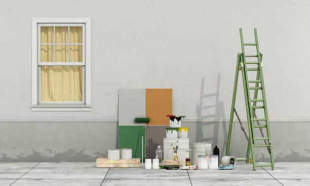
To avoid costly mistakes, always paint large sample boards, measuring at least two feet by two feet, using the actual paint formula you plan to purchase. Do not paint directly onto the house wall initially, as the existing color can bleed through and distort the sample. Move these sample boards to different sides of the house throughout the day to see how they look in morning, afternoon, and evening light.
Additionally, modern digital color visualizers can help you narrow down your choices. Many paint manufacturers offer online tools or mobile applications that allow you to upload a photo of your house and apply different paint combinations digitally. While these tools do not replace physical testing, they provide an excellent starting point for visualizing the overall color scheme.
Frequently Asked Questions About Exterior House Paint
What exterior paint colors make a house look bigger?
Light colors, such as crisp whites, soft creams, pale grays, and light pastels, reflect the most light and make a home appear larger and more prominent. These shades draw the eye outward, expanding the visual footprint of the property relative to its surroundings.
Should the trim be lighter or darker than the main house color?
Both approaches are effective depending on the desired aesthetic. A lighter trim is classic and emphasizes architectural details by framing them cleanly, while a darker trim offers a modern, bold look that creates a strong geometric presence.
How do you choose an exterior paint color that does not fade?
To minimize fading, select lighter neutrals, mineral tones, or earth-based pigments like ochres and browns, which are highly stable under UV light. Bright, highly saturated organic colors, such as vibrant reds, deep blues, and intense yellows, are more susceptible to fading from sun exposure.
Does painting a house a dark color make it hotter?
Yes, dark colors absorb more heat than light colors. In warm climates, painting a house a dark shade can increase the surface temperature of the siding, potentially raising cooling costs. In colder climates, however, dark colors can assist in passive solar heating.
How often should you repaint the exterior of a house?
Most homes need to be repainted every five to ten years, depending on the quality of the paint used, the climate, and the material of the siding. Wood siding typically requires more frequent maintenance, while fiber cement and stucco can often go longer between paint jobs.
Final Recommendations for a Successful Exterior Paint Project
A successful exterior paint project relies on thorough preparation, quality materials, and a well-considered color strategy. Before purchasing paint, research local homeowners association guidelines or regional preservation rules to ensure compliance. Consulting with local real estate experts can also provide valuable insight into which colors are currently preferred by buyers in your specific market.
Investing time in proper surface preparation, including washing, scraping, sanding, and priming, is essential to ensure the paint adheres correctly and lasts for years to come. By selecting colors that harmonize with your home's architecture, local climate, and surrounding landscape, you will create a beautiful, durable exterior that enhances your home's value and visual appeal.